See Your Data Differently. Discover Insights Instantly.
Tableau’s worksheet canvas puts the full power of visual analytics in your hands — transforming raw data into clear, interactive, and meaningful visualisations.
Raw data only drives decisions when people can understand it. Tableau’s worksheet environment is built around an intuitive drag-and-drop canvas that lets every user — regardless of technical skill — build, customise, and interact with visualisations that reveal what the numbers really mean. From selecting the right chart type to fine-tuning every visual property, Tableau’s worksheet capabilities make exploration fast, flexible, and accessible.
DRAG-AND-DROP ANALYTICS
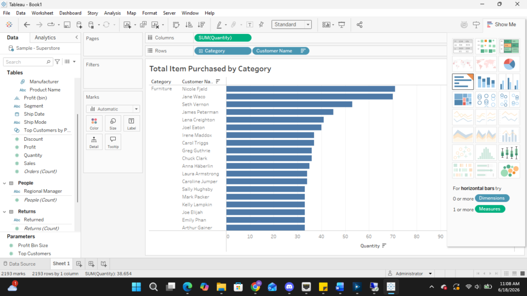
Tableau’s worksheet is where analysis comes to life. Simply drag dimensions and measures from the Data Pane onto the Columns and Rows shelves, and Tableau instantly renders the most appropriate chart. Use the Show Me panel to explore alternative chart types with a single click — no coding or manual chart configuration needed.
• Drag fields onto Columns & Rows shelves
• Show Me panel recommends the best chart type
• Swap chart types instantly with one click
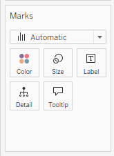
MARKS CARD
The Marks Card is the visual control centre of every Tableau worksheet. It lets you encode additional dimensions and measures directly into your chart’s visual properties — without adding new axes or cluttering the view. Assign any field to Colour, Size, Shape, Label, Detail, or Tooltip to reveal multiple layers of meaning within a single visualisation.
• Color: encode a dimension or measure using a color palette
• Size: scale marks proportionally by a measure value
• Label: display values directly on the chart marks
• Tooltip: show rich contextual data on hover